
Beginner’s Guide to Bootstrap CSS in the Contact Form 7 [updated 2020]
If your site has Bootstrap CSS then you most likely want to add the Bootstrap classes to your Contact Form 7 as well. Because the form is created directly in the Contact Form 7 plugin page.
You might be wondering how to add an external class to it?
It’s pretty easy to add the Bootstrap classes to your form. You cannot use the HTML class="" attribute as it is, Instead you need to use the Contact Form 7 tags to include the class in your form.
What is a tag: A form template (a set of snippets you see in your Contact Form 7 page) contains multiple tags (a.k.a form tags) that will be replaced with an HTML elements/attributes when renders in the browser.
class and id are considered tag ‘options’. Because they are optional.
- Index
- Contact Form 7 code
- How to add Bootstrap class in the Contact Form 7
- Inspect the code in the DOM
- How to add Multiple Bootstrap classes
- How to add
forattribute in the Label andidin the Input - Wrapping your form elements with Bootstrap
form-groupdiv - Can I wrap the form with Boostrap
<form>? - How to add Bootstrap class to form help text
- How to add Bootstrap class to your
<label>element
- Troubleshooting
Contact Form 7 code
Contact Form 7 comes with a default template (form template) with only the minimum tags.
<label> Your Name (required)
    [text* your-name] </label>
    -----  ---------
     tag      tag

<label> Your Email (required)
    [email* your-email] </label>

...
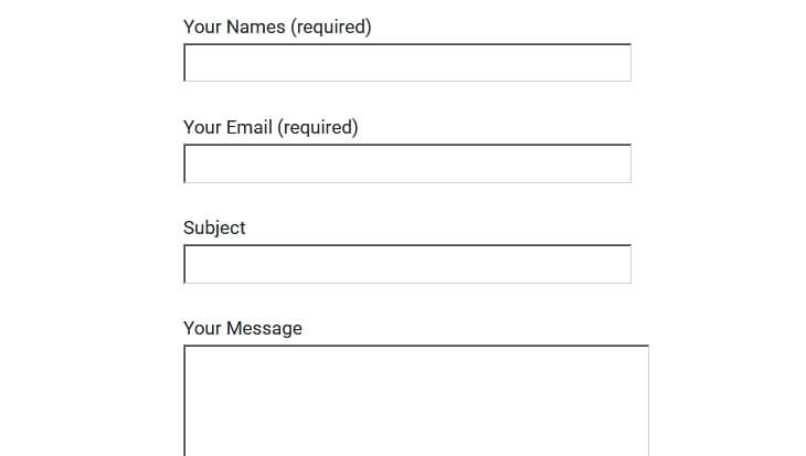
When you render the page with the minimum tags, this is what you get (Fig 1). This is without the Bootstrap class applied.
I assume you have already included Bootstrap CSS and JS to your website.
How to add Bootstrap class in the Contact Form 7
The standard HTML class attribute is class="form-control". To add this to your Contact Form 7 form template, it has to be in the Contact Form 7 tag format.
<!-- HTML attribute -->
class="form-control"

<!-- Contact form 7 tag -->
class:form-control
Adding class:form-control tag to the Contact Form 7 form template
<label> Your Name (required)
    [text* your-name class:form-control] </label>
...
Inspect the code in the DOM
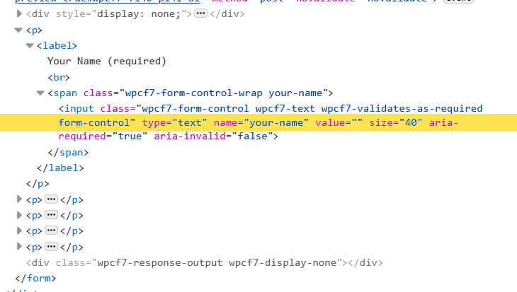
If you look at the DOM, you can see the class:form-control tag is rendered and added as an HTML class attribute to the input element.
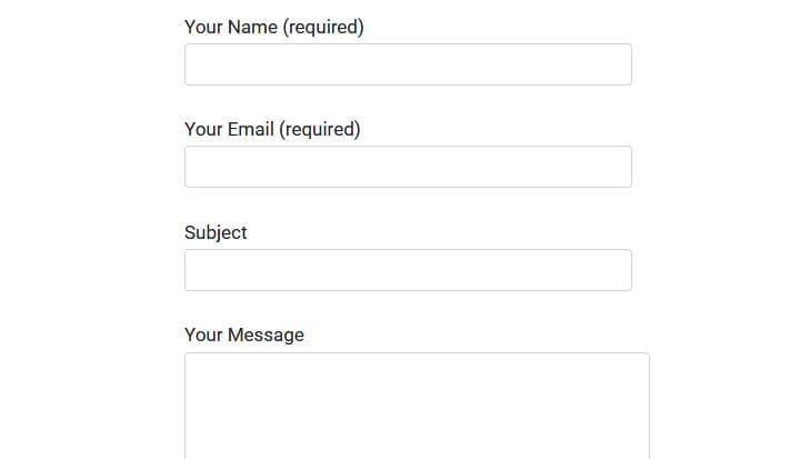
Here’s the Output of the form in the browser with the Bootstrap class applied.
It’s not that hard huh..
How to add Multiple Bootstrap classes
As you know Boostrap has multiple classes for most of the HTML elements. Specifically for form, they have – form-control, form-control-sm, form-control-lg, form-control-plaintext, form-control-range, form-check-input and so on… Sometimes you need to add multiple classes to get the desired result.
If you want to add multiple classes in the HTML, you use class="form-control form-control-sm all in a single attribute, class="".
In Contact Form 7 it will be treated as individual tags. In simple words, you should have only one tag for one class. If you want multiple classes to your element, then you need to have multiple tags.
<!-- Contact Form 7 class attribute for multiple classes -->
class:form-control class:form-control-sm
------------------ ---------------------
        tag                tag
Adding multiple tags class:form-control and class:form-control-sm tags to the Contact Form 7 form template.
<label> Your Name (required)
    [text* your-name class:form-control class:form-control-sm] </label>
...
How to add for attribute in the Label and id in the Input
If you notice, the label element in Contact Form 7 is wrapped around the input tag. The HTML elements are usually separated.
<!-- Contact Form 7 tag -->
<label> Your Name (required)
    [text* your-name class:form-control] </label>

<!-- HTML element -->
<label>Your Name (required)</label>
<input type="text" name="your-name" class="form-control">
So let’s separate the label and the input in the Contact Form 7. Yes, you can do that.
<label> Your Name (required) </label>
[text* your-name class:form-control]
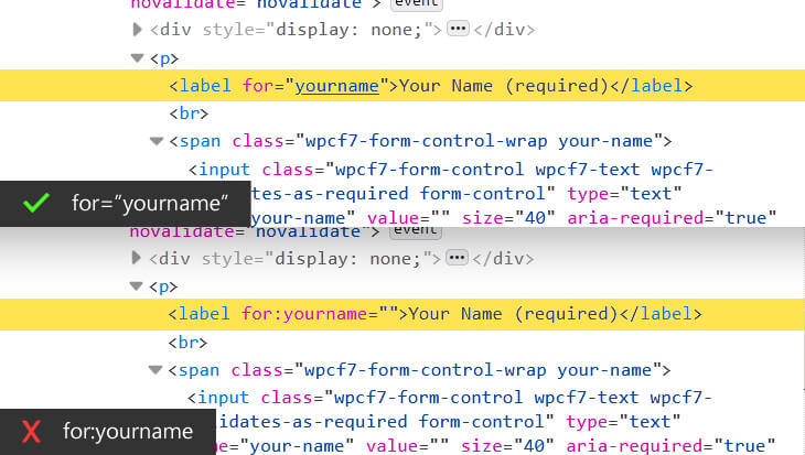
When adding for attribute to the label, you should not use the tag style syntax, class:form-control. It will not work.
You need to use the actual HTML attribute for="yourname"
<label for="yourname">Your Name (required)</label>
[text* your-name class:form-control]
The difference of using the for="yourname" attribute and form:yourname tag. Here’s how it renders in the DOM.
To add the id attribute in the input field, you use the tag, same as the class.
<label for="yourname">Your Name (required)</label>
[text* your-name class:form-control id:yourname]
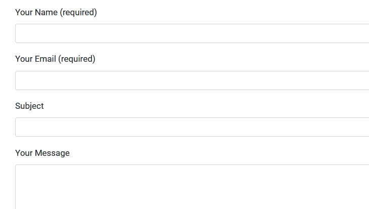
Final output with all the attributes for, id, and class
Wrapping your form elements with Bootstrap form-group div
Did you know you can add any HTML element outside the form template?
Yes, you can use the Bootstrap form wrapper form-group to each of your Contact Form 7 form templates
<!-- Using Boostrap 'form-group' as wrapper -->
<div class="form-group">
    <label for="yourname"> Your Name (required)</label>
    [text* your-name class:form-control id:yourname]
</div>
...
By default Contact Form 7 wraps each of your form element with a p tag. If you add the form-group the p will be automatically replaced.
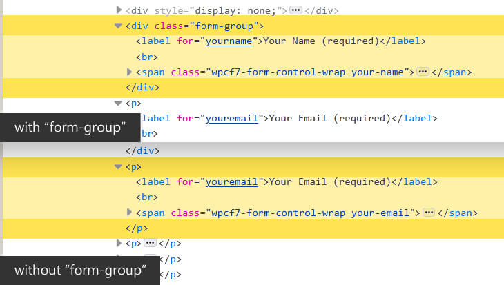
Here’s how the final code looks
<div class="form-group">
    <label for="yourname"> Your Name (required)</label>
    [text* your-name class:form-control id:yourname]
</div>

<div class="form-group">
    <label for="youremail"> Your Email (required)</label>
    [email* your-email class:form-control id:youremail]
</div>

<div class="form-group">
    <label for="subject"> Subject </label>
    [text your-subject class:form-control id:subject]
</div>

<div class="form-group">
    <label for="yourmessage"> Your Message </label>
    [textarea your-message class:form-control id:yourmessage]
</div>

[submit class:btn class:btn-success "Send"]
Can I wrap the form with Boostrap <form>?
We have seen how to add multiple HTML attributes and elements inside the Contact Form 7 form template.
What if you want to wrap everything with the Bootstrap <form> wrapper.
Before you add if you notice your existing form in the DOM. It already has a wrapper <form> from the Contact Form 7.
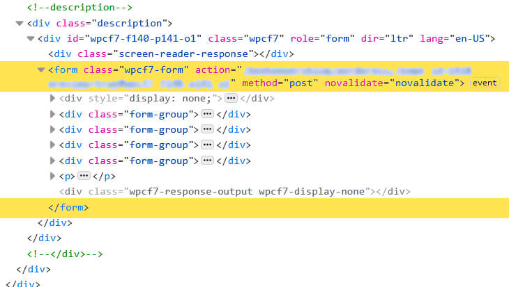
What happens if you still apply the <form> in the form template.
<form>
    <div class="form-group">
        <label for="yourname"> Your Name (required)</label>
        [text* your-name class:form-control id:yourname]
    </div>

    ...

    [submit class:btn class:btn-success "Send"]
</form>
If you do so, Contact Form 7 will throw an error before you save the changes. You will see this error in 3 places.
But why do I get the error?
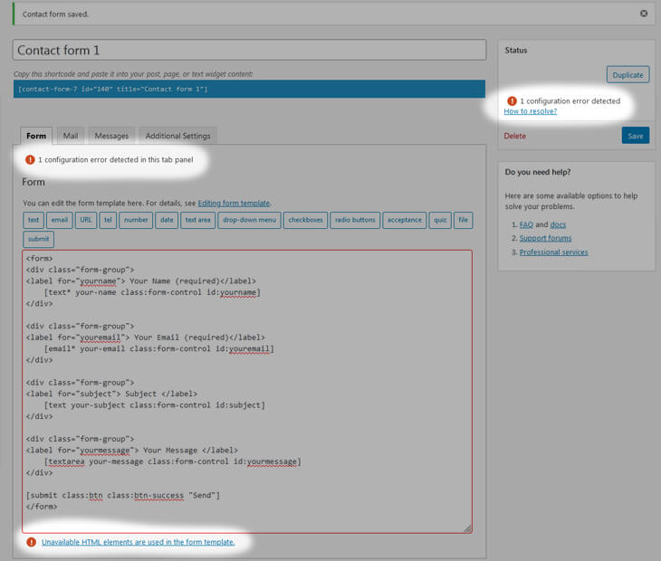
According to the HTML specification you cannot nest an <form> element in another form element. Contact Form 7 already has a <form> with all the action, method attributes and you are trying to wrap with another <form> wrapper which forces the error message.
How to add Bootstrap class to form help text
Just like any other element you can add the Bootstrap predefined form ‘help’ text using the .form-text .text-muted classes under the input field.
Let’s look at how to write this code and how it renders.
<div class="form-group">
    <label for="yourname"> Your Name (required)</label>
    [text* your-name class:form-control id:yourname]
    <small class="form-text text-muted">Enter your full name.</small>
</div>
You must have noticed a large space between the input field and the help text. If you look at the code you can see an <br> element on every new line.
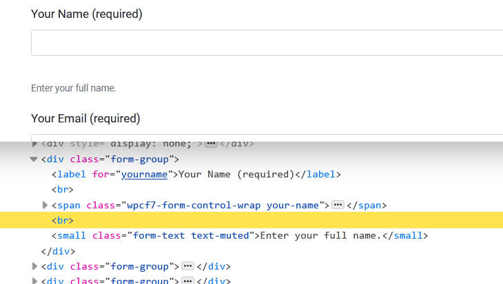
This happens because there is a function in WordPress called wpautop which creates this by default whenever you have a new line.
wpautop is a WordPress function. When you enter a text in your visual editor and save it, the text then wraps with a paragraph automatically when it renders. When you break the text twice and it considers as a new paragraph. All these are taken care of by this function.Contact Form 7 has a build in constant to turn off this. It’s called WPCF7_AUTOP
Can you access your WordPress root direction? Yes..
If you can access your WordPress files then go to your root folder in your WordPress directory and open the file called wp-config.php and add this code from below.
By default, WPCF7_AUTOP is set to true and we are changing that to ‘false’.
/* for Contact-Form-7 */
define('WPCF7_AUTOP', false);

/* That's all, stop editing! Happy blogging. */
Don’t have access to WordPress root directly?
Well don’t worry, you can do the same in your functions.php in your theme folder.
/* for Contact-Form-7 */
add_filter( 'wpcf7_autop_or_not', '__return_false' );
Refresh the page and you should not see any space above the form ‘help’ text.
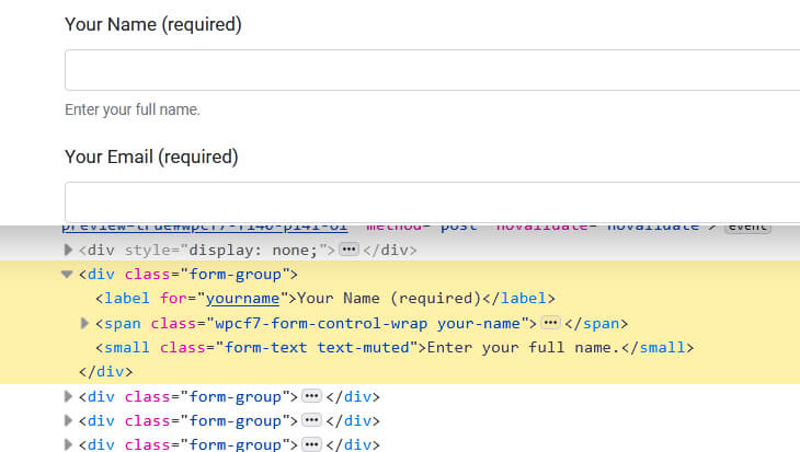
This functions
wpcf7_autop_or_not strips out all the p and <br> from the form. If you are not using Boostrap class in the form template (which takes care of all the margins and paddings and display properties), you might find some weird styling to your output.Here’s the output of the form without Boostrap class applied and set the wpcf7_autop_or_not to ‘false’.
Remember the website has Bootstrap CSS included. Only the form classes are not applied.
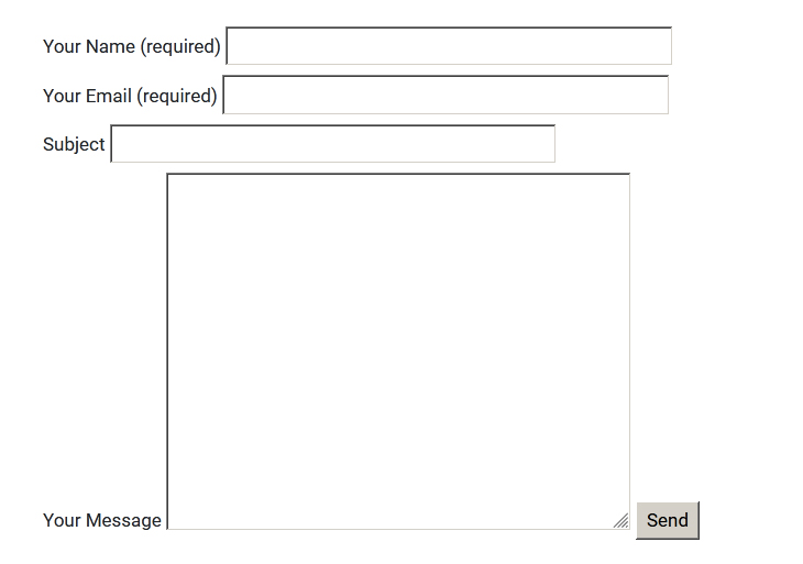
wpcf7_autop_or_not to false.How to add Bootstrap class to your <label> element
Unlike input tags, you cannot add the class tag class:text-danger to your ‘label’ element. The <label> is a standard HTML element so you need to use the HTML attribute, not the Contact Form 7 tag.
Because ‘Your Name’ is a required field, we will add text-danger class to the <label>. Like so.
<div class="form-group">
    <label class="text-danger" for="yourname"> Your Name (required)</label>
    [text* your-name class:form-control id:yourname]
</div>
I have Added the Boostrap class, but it is not working [Troubleshooting]
Pay attention to where you place the tag in the form template. This is very important. Unlike HTML you cannot place the class/id wherever you want.
Place the class tag at the end of the element.
<!-- ✖ wrong -->
<label> Your Name (required)
    [class:form-control text* your-name] </label>

<!-- ✖ wrong -->
<label> Your Name (required)
    [text* class:form-control your-name] </label>

<!-- ✔ correct -->
<label> Your Name (required)
    [text* your-name class:form-control] </label>
Boostrap class not working in the ‘Send’ button [Troubleshooting]
When it comes to the Send button in the Contact Form 7, you need to add the Bootstrap class (tag) after the text submit and before the “Send” value.
<!-- ✖ wrong -->
[submit "Send" class:btn]

<!-- ✔ correct -->
[submit class:btn "Send"]


